Table of Contents
Understanding Flutter Layout: Constraints, Sizes, and Positions
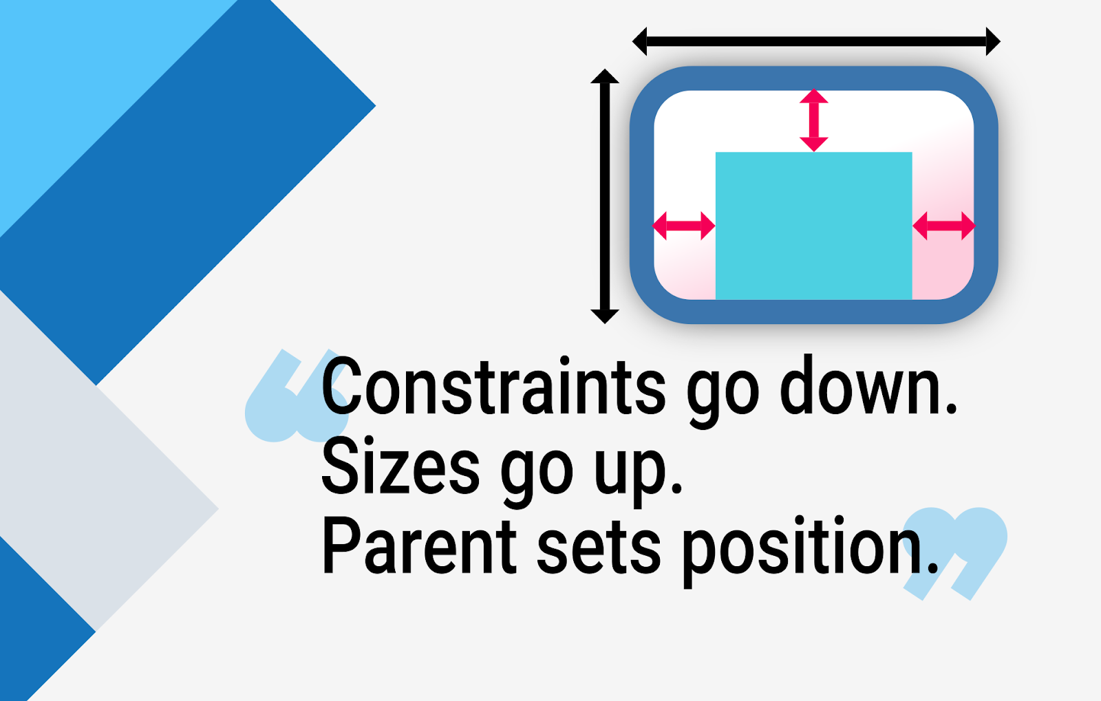
At the heart of every Flutter widget is a system of constraints. Constraints define the rules a widget must adhere to when determining its size and position. Understanding this is key to avoiding common pitfalls like overflow errors and ensuring your UI works well across all devices and user preferences.
If you're new to constraints or need a deeper dive, I highly recommend reading Flutter's guide to constraints. It's a must-read for every Flutter developer and provides examples that will solidify your understanding of how widgets are laid out in Flutter.

Key Recommendations
1. Build UIs From the Inside Out
When translating a Figma design into Flutter, a common mistake is starting with the outer container and working inward. This approach often results in overly restrictive constraints for child widgets.
Instead, start building from the smallest widgets and move outward. This lets Flutter handle sizing naturally and prevents unnecessary rigidity.
Why Flexibility Matters
It’s not just about fitting widgets on the screen—it’s about ensuring they remain usable for everyone. For example:
Users with visual impairments often increase the system font size. If your widgets are rigidly constrained, this can lead to overflows or cut-off text. Testing for dynamic font sizes is essential to ensure accessibility. Use Flutter's MediaQuery to check and respond to the device's text scale factor:
All the code in this blog post is in Dart
- Dynamic content, such as localized strings, can vary in length. Without flexible design, your layout may break or behave unpredictably when content changes.
By prioritizing flexibility, you create designs that are not only visually consistent but also robust and accessible for all users.
Pro Tip: Let Flutter Decide
Don’t control everything; instead, focus on defining how widgets interact with each other. For example, use padding between elements instead of setting fixed widths or heights for parent containers. This makes sure your layout adapts naturally, even when content changes.
2. Always ensure Defined Constraints
To avoid overflows, ensure every widget has well-defined constraints. A common scenario where this is overlooked is in rows:
This can lead to overflow issues on smaller screens because Row gives its children infinite horizontal space. The fix? Use widgets like Expanded or Flexible to manage constraints properly:
Tip: Use LayoutBuilder to check if the parent has defined constraints for its children. For instance:
This helps you debug issues by revealing how the constraints are being passed down the widget tree.
3. Adapt to different Screen Sizes
UIs that look great on one screen size can appear awkward on others. To address this, adopt strategies to make your layouts adaptable:
- For Larger Screens (e.g., Wide Monitors):
Use a combination of ConstrainedBox and Center to limit the maximum width of your content. This enables the user to focus on the content without excessive lateral movement:
- By limiting the width, you improve usability on large screens, so that users can interact with the content comfortably without straining their necks or moving their eyes too much.
- Dynamic Layouts for Medium to Large Screens:
Vertical scrollable lists can look out of place on larger screens. Instead, dynamically adjust the layout to use a grid format with SliverGridDelegateWithMaxCrossAxisExtent:
4. Avoid Screen-Size-Based Calculations
Calculations tied to screen size are prone to breaking in unexpected ways. Instead, use the parent widget’s constraints via LayoutBuilder.
Real Example: Pronti Layout
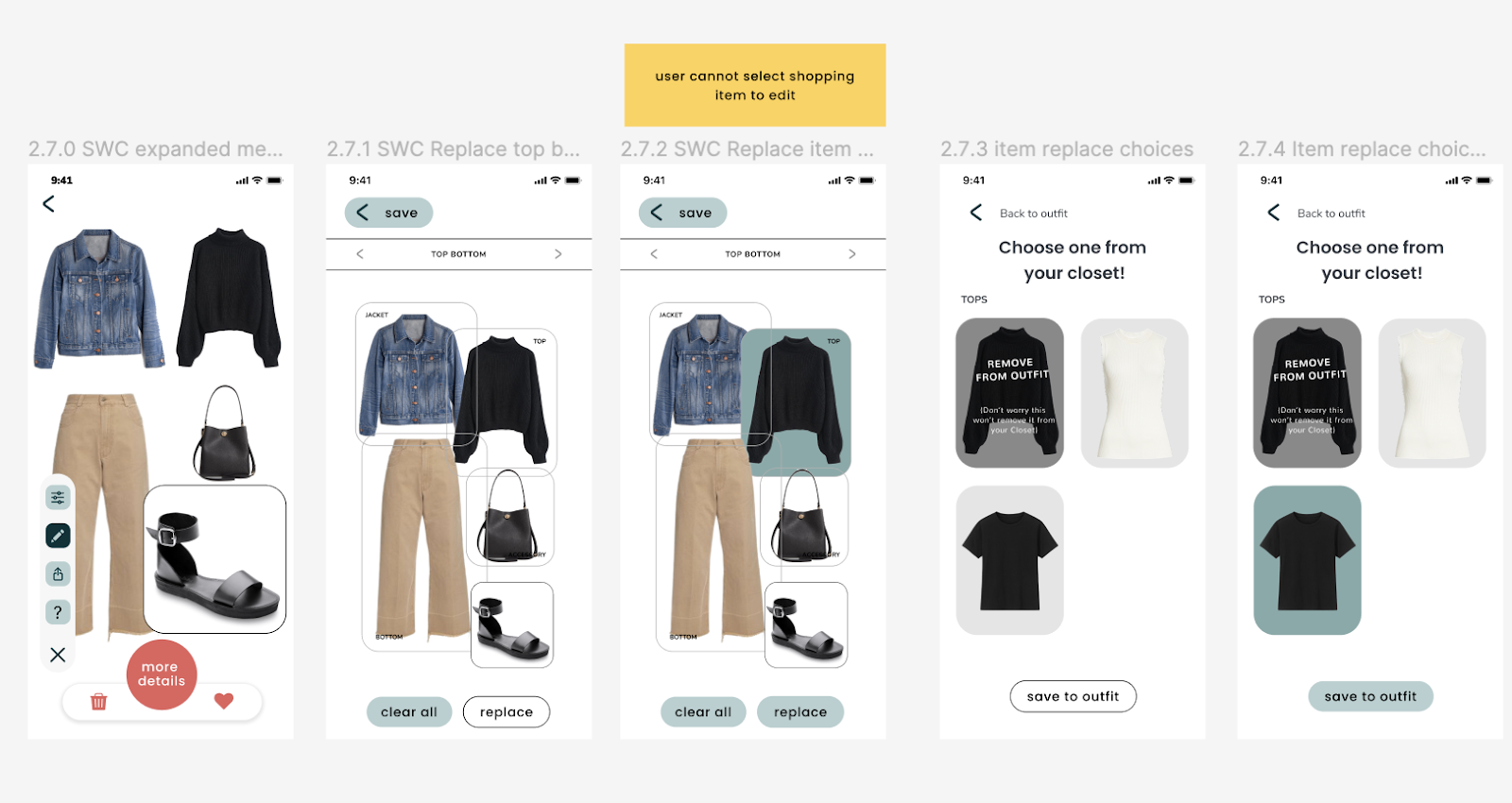
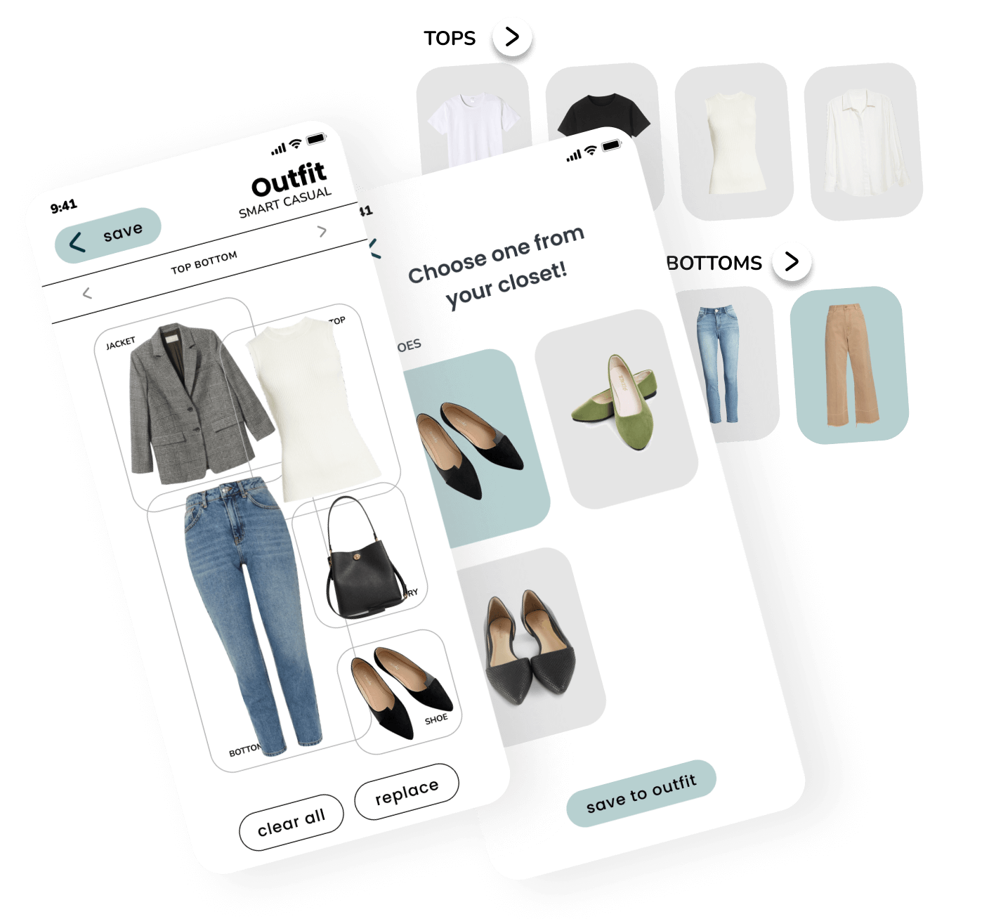
Pronti is an app powered by AI (Artificial Intelligence) that provides tailored outfit ideas and shopping suggestions based on users' current wardrobe, the occasion, and their mood. When working on Pronti’s project, we created a widget that positioned clothes dynamically based on the parent’s constraints. This approach made the layout flexible and resilient, so that it adapted seamlessly to different sizes without breaking.

By basing the layout on the parent’s constraints, we guaranteed flexibility and maintained a consistent design across all devices.

5. Test your UI Across Devices
Even after following all the best practices, it’s essential to test your UI on different devices and screen sizes to ensure everything works as expected. A fantastic tool for this is the device_preview package. It allows you to preview your app on various device types, sizes, and orientations directly from your development environment.
With this package, you can easily identify and fix layout issues, ensuring your app looks great on phones, tablets, and large screens.
More detailed Practices
If you found these tips helpful, I’ve covered even more practices for building solid UIs in Flutter during my talk at Flutter Festival. In the talk, I delve into constraints, layouts, and real-world examples to improve your Flutter development workflow.
All in all, building solid UIs in Flutter requires a good grasp of its layout system and a thoughtful approach to constraints and responsiveness. By:
- Starting from the inside out
- Ensuring defined constraints for every widget
- Using adaptive widgets like grids for different screen sizes
- Using ConstrainedBox to optimize content for wide screens
- Avoiding rigid screen-size calculations
- Accommodating larger text sizes for accessibility
- And leveraging tools like device_preview and responsive_builder
You can create flexible and robust UIs that look and work great on any device. Remember, the key is to let Flutter do the heavy lifting while you focus on crafting user-friendly interactions.
Ready to build better UIs? At Somnio Software, we specialize in building custom applications with exceptional user interfaces. Let us help you turn your dream project into reality. Contact us to get started!
If you wish to learn more about constraints, read Flutter’s official guide!
Building robust and responsive UIs in Flutter can be both exciting and challenging. Flutter's widget-based architecture gives developers a great deal of flexibility, but with great power comes great responsibility. In this article, we’ll explore some actionable best practices to build solid UIs in Flutter, starting with a foundational understanding of constraints and layout. By the end, you’ll have actionable recommendations to create UIs that are not only visually stunning but also reliable and adaptable across devices.


.png)
.png)